Problem
Tribu started with nothing: no logo, no site, no voice. And every brand it would sit next to looked the same: dark, blue, circuit-board tech.
Decision
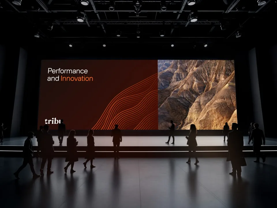
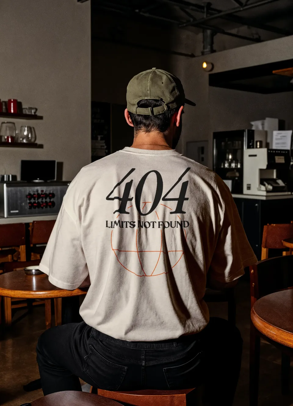
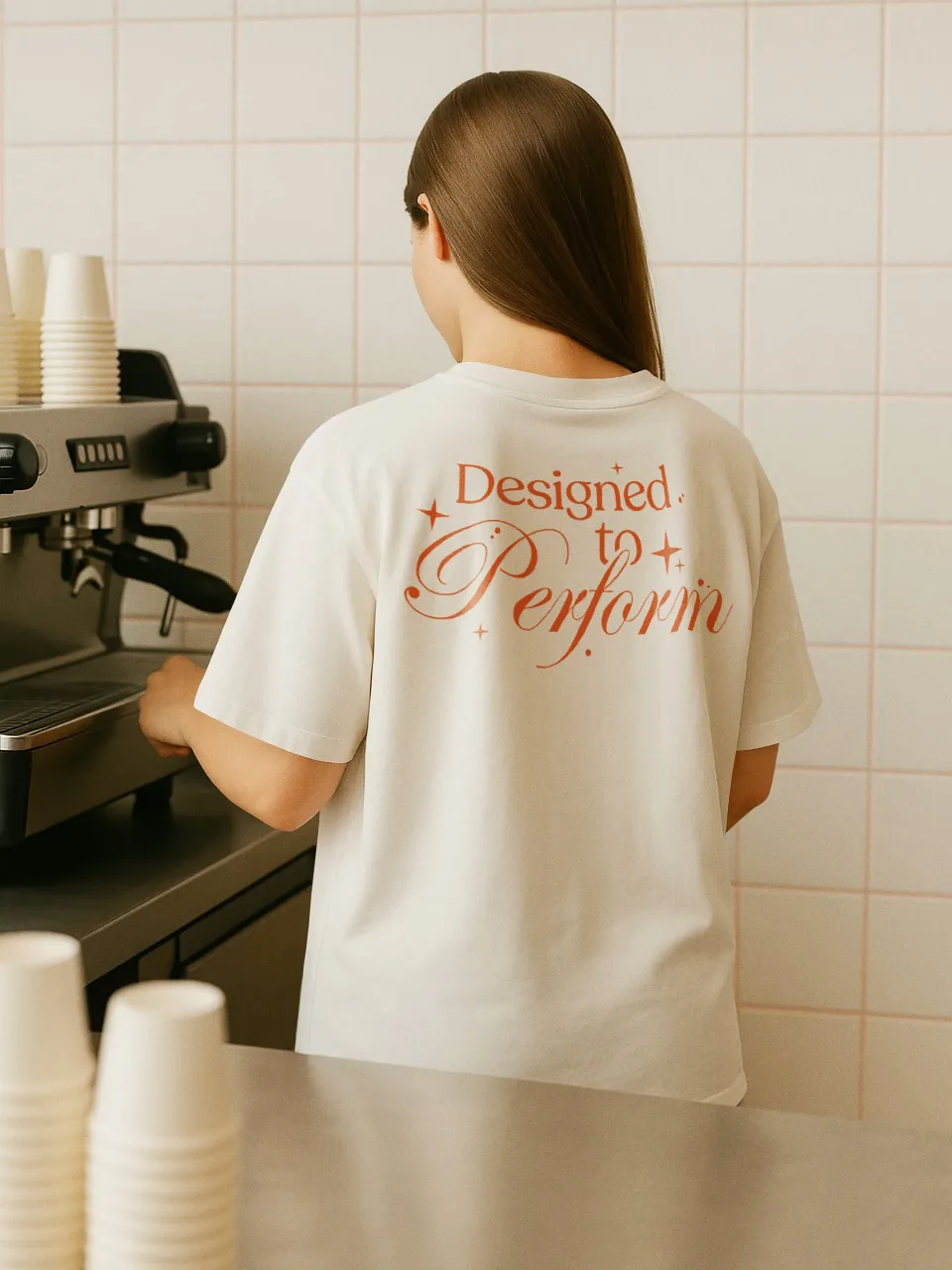
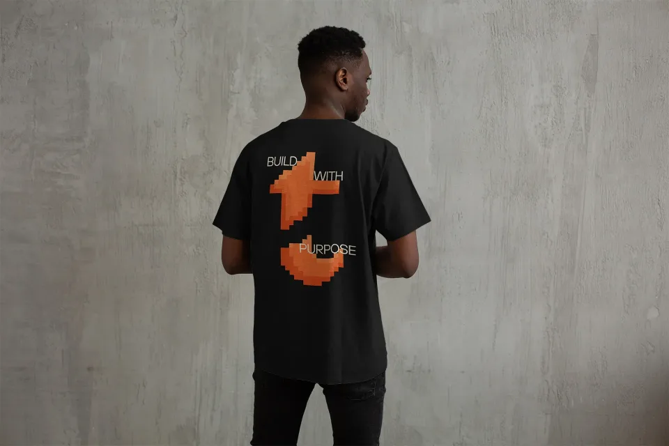
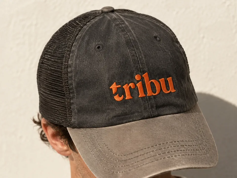
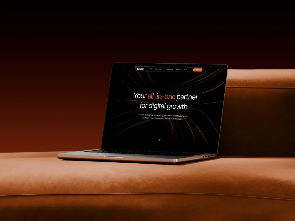
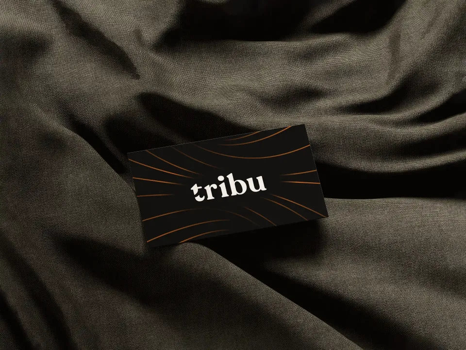
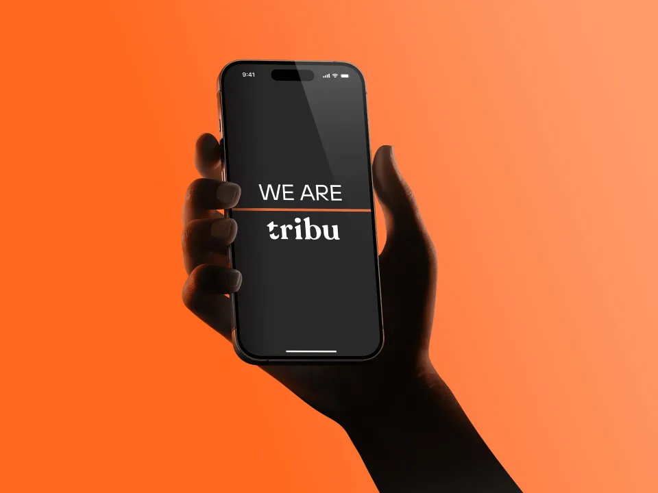
Keep one foot in tech and put the other somewhere warmer: a lowercase wordmark, orange and black instead of neon blue, and lines that work on a T-shirt ("404, limits not found") and still close a deal on stage.
- 01Lowercase, so it reads as people, not machines
- 02Orange and black, never the usual tech blue
- 03One voice from T-shirt to sales deck
Result
First version of the site live in under three weeks. It now runs 32 pages, 64 with the Spanish version on the way, and the same brand carries from the site to the decks, the stage screen, the T-shirts, the cap and the business card. Leads come in through the form, and people keep telling the team the site looks great.